Rock Thee Well
Ed. note: corrections appended below.
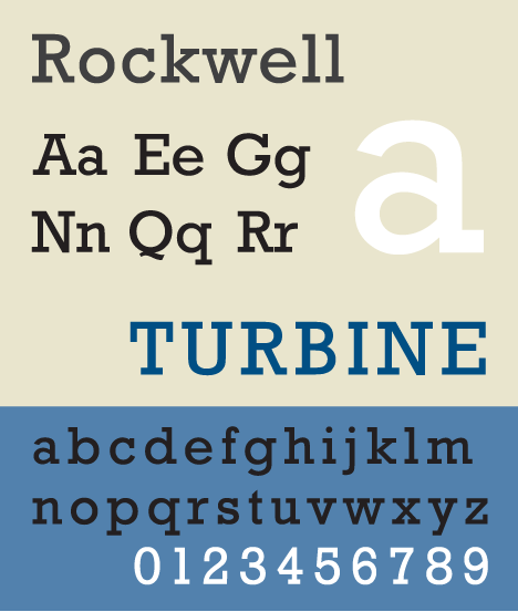
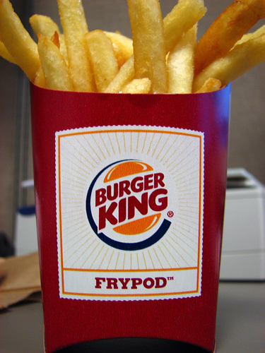
One doubts that the home of the Whopper would have much client base in common with the paper of record’s Sunday magazine. Yet as a matter of course both Burger King and the New York Times Magazine stand behind the same face. Let me clarify. My first mentor in design once explained to me that a typeface was called such because, like a face, each one is unique. Of course, one could reliably say the same about snowflakes or tigers and still not be able to tell the difference between them even while having one’s arm gnawed off in Siberia, but the point stands. In the case of typefaces, a small subset of creative people cares very deeply about differences that most others would ignore. And in the eyes of today’s font gazers one of the movers in many circles goes by the name Rockwell.

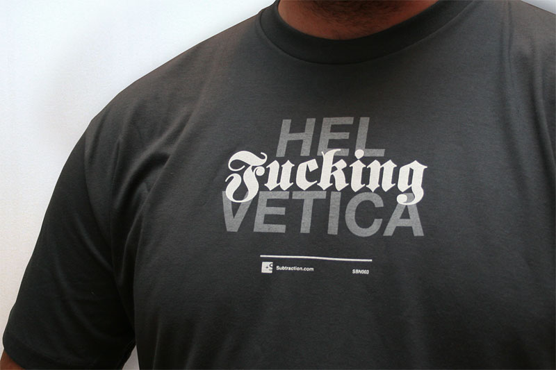
The broad popularity of a typeface is unique; usually, fonts tend to stake out their own territory. The current battle being waged by acolytes of Helvetica upon the Arial-using infidels strikes one as the same sort of one-way-superiority-met-with-blithe-indifference between Mac and PC users. Those for whom typography, pallette, and anti-aliasing are affairs of the heart will always be fighting an uphill battle against those whose eyballs glaze over the differences between, say, Safari and Internet Explorer. Yet, the sordid history of Arial has been retold so many times within this group that one can literally take up arms (or sans-serifs) and fight the battle online. Alas, the battle is more a test of motor skills than the actual merits of the better typeface — which, if you’ve been paying any attention, should be clear by now.
In his series of posts on design and social class designer Christopher Fahey touches on the stratification of taste along class lines. His conclusion, in part, that the eyes of many in the design profession are too narrowly focussed to adequately communicate beyond their concentric world would seem to jibe with the number of brands that incongruously pander visually to an upscale clientele that does not exist for its products. Design as aspiration seems to be the niche that Target has created for itself, dragging the other big box stores in its wake. Similarly, in their book Freakonomics, authors Levitt and Dubner argue that today’s upmarket first names will be tomorrow’s common ones, noting the cyclical and aspirational nature of baby naming. Design, then, can be construed as a way for consumers to process aspiration. IPod, meet Frypod.
But can there be such a thing as a hit in typography? A blockbuster? The surge in the popularity of Rockwell must have come from somewhere. The Times Magazine’s use of the face goes back at least to 2001, though it has been used more prominently since 2004. One might think that Apple’s decision to bundle Rockwell with the release of its Tiger operating system in 2005 is also part of what sparked the resurgence. But could Apple’s position as weathervane of the creative world be that pervasive? The evidence is only anecdotal. Nevertheless, the Rockwell-savvy Burger King campaign launched in ‘05. And considering that Getty Images, Lakai and Nike have all dabbled in Rockwell of late, one would think that we were in the midst of a moment.
Et tu GQ?
(actually, non, the face in question is called Lubalin)
When considering that the highly decorated advertising firm CP+B (who handles the Burger King account) is as likely to have the same relative percentage of talented designers on its staff as the Times Magazine, the font’s promiscuity brand and class-wise becomes less of a surprise. What remains fascinating, however, is how many unique applications the face is chosen to perform. Rockwell, it seems, has resurfaced as a sort of class-blind, intention-agnostic wonder in the world of design. The never-ending array of uses for the font as chosen by designers speaks to the integrity of the font itself  it is well designed enough to say anything. Or, as a non-designer might remark upon the conclusion of this conversation, “yeah, whatever.†It would be gauche to say otherwise.
Update: our crack team of researchers has revealed that the BK/NYTM font is more likely to be Stymie. That said, Rockwell, Stymie and Lubalin all fit into a subset of faces known as slab-serifs at whose pliability we may still marvel. That terrible sound you hear is a tiger gnawing through the tendons in my elbow. Their teeth are quite like razors, actually.
—
wiki history of Rockwell.
more on helvetica v arial.
Of course, there’s the helvetica documentary too.


Comments:
I suppose there are a certain number of design patterns and tropes (including fonts) that have, just as some people have, a kind of social mobility that most others cannot muster. Comic Sans is trapped in the lowest caste, while Rockwell apparently has full social fluidity. Class X.
Similarly, Helvetica frustrates this simple stratified model. To modern design aesthetes, Helvetica is a rarified and intellectual escape from gaudy decorative typography. But ornament isn’t exclusively the provenance of the sequin-bedazzled poor and the ostentatious nouveau riche. Some of our highest classes live comfortably surrounded by Victorian and Art Nouveau decor and aesthetics. And to their refined tastes, Helvetica is the boring, dull, and utterly soul-crushing font used in public bathrooms and goverment documents — a far cry from the formal purism modernist design wonks think of it as.
I think what you’re hinting at in this case is the classic fork that has always existed between the Modern and the Classical. In any form: music, let’s say, it is possible to be up-to-the-minute contemporary, or to harken backwards to classical forms and still be fresh. Ornaments such as serifs are inherently classical. Perhaps Rockwell and other slab fonts provide a take on that ornamentation that feels very modern given other trends in contemporary design.
[…] Here’s another article I found about Rockwell’s eventual world domination: Rock Thee Well […]
[…] More info : http://desedo.com/blog/rock-thee-well/ […]
[…] know it. The overstated Burger King font. A hit member of a class of slab-serifs, it could not be more over-the-top, beating you over the head with brutish inelegance. It makes me […]
[…] bold typographic way – like we will be doing with Rockable Press. According to the Desedo Blog Rockwell is also experiencing a bit of a resurgence in popularity which might explain why I think it seems modern. Anyhow here’s an amusing video courtesy of […]