
Love these two films. Wondering how ROI will be tracked by the brands and when adapted into features, who owns the rights.
http://www.youtube.com/watch?v=XOZkLIwbRrw
HT to Farrah Bostic
Love these two films. Wondering how ROI will be tracked by the brands and when adapted into features, who owns the rights.
http://www.youtube.com/watch?v=XOZkLIwbRrw
HT to Farrah Bostic
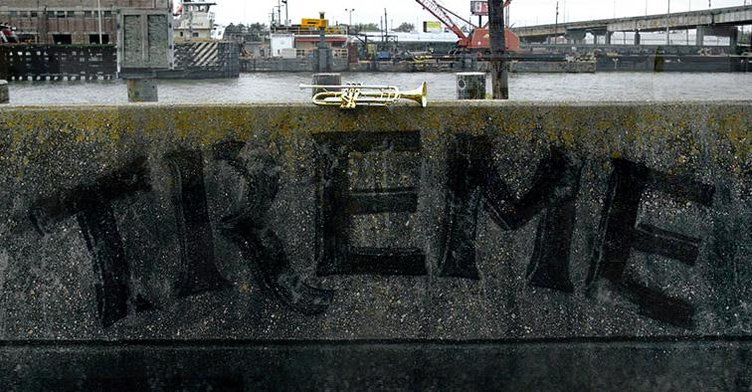


The Treme logotype is everything that it’s counterpart is not. It’s an accurate example of hand-painted lettering that instantly conjures an image of the New Orleans culture. Because it’s handmade, it’s also real— the stylistic affectations and imperfections are what give it character.

On the other hand, the title/credit type feels odd, almost forced. It seems to be some sort of mid-weight serif font, perhaps Bell MT, stuck between old style typefaces like Garamond and a transitional face like Bodoni. It doesn’t pair well with the show or even offer any stylistic continuity. The Treme logotype evokes New Orleans neighborhoods, lifestyle, and culture. The title font evokes an antiseptic book report.

Sure, it contrasts with the powerful imagery in the intro theme, but it has a completely undesirable effect. Rather than making the images themselves pop and feel more powerful, the typographic contrast is jarring, and distracts the viewer from the imagery. So what was Simon thinking? While the typeface does have a genuine feeling, it certainly is not that of New Orleans. My guess is that he chose it because the ball terminals on the font’s letterforms bear a semblance musical notation. Yet notation isn’t really the essence of Jazz, or New Orleans for that matter, both of which represent a diametric shift from Western norms of that era.
Watching the show, loving the show, but still confused by the credits.
(Written by Desedo friend Ryan Reynolds, who is the Design Director at MSDS.)


This spot comes out of the gate with traction, it calls on a collective cultural memory and is thus all the more sticky. It’s also disruptive in a way that I’ve been waiting to see. I’m curious to know about how use of the jingle was brokered with Wrigley, and of course, if any other F500 brands have done something bold like this.

I like lonely old cars in motion.