Tag: pop culture

  • Treme Type

    Treme Type

    What went wrong? I married a goddamn musician.
    HBO’s new series, Treme, is David Simon’s thoughtful, measured, and consistent vision of New Orleans. Yet the credit typography misses the mark so wide that I’ve wondered if the distraction is intentional. Perhaps I was missing something. But after having slept on it, I believe that it’s a mistake.

    The Treme logotype is everything that it’s counterpart is not. It’s an accurate example of hand-painted lettering that instantly conjures an image of the New Orleans culture. Because it’s handmade, it’s also real— the stylistic affectations and imperfections are what give it character.

    On the other hand, the title/credit type feels odd, almost forced. It seems to be some sort of mid-weight serif font, perhaps Bell MT, stuck between old style typefaces like Garamond and a transitional face like Bodoni. It doesn’t pair well with the show or even offer any stylistic continuity. The Treme logotype evokes New Orleans neighborhoods, lifestyle, and culture. The title font evokes an antiseptic book report.
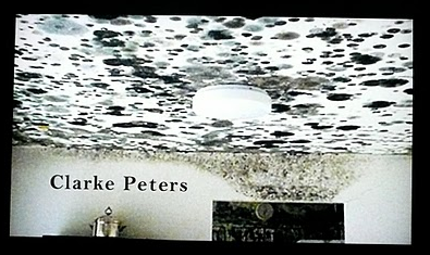
    Sure, it contrasts with the powerful imagery in the intro theme, but it has a completely undesirable effect. Rather than making the images themselves pop and feel more powerful, the typographic contrast is jarring, and distracts the viewer from the imagery. So what was Simon thinking? While the typeface does have a genuine feeling, it certainly is not that of New Orleans. My guess is that he chose it because the ball terminals on the font’s letterforms bear a semblance musical notation. Yet notation isn’t really the essence of Jazz, or New Orleans for that matter, both of which represent a diametric shift from Western norms of that era.
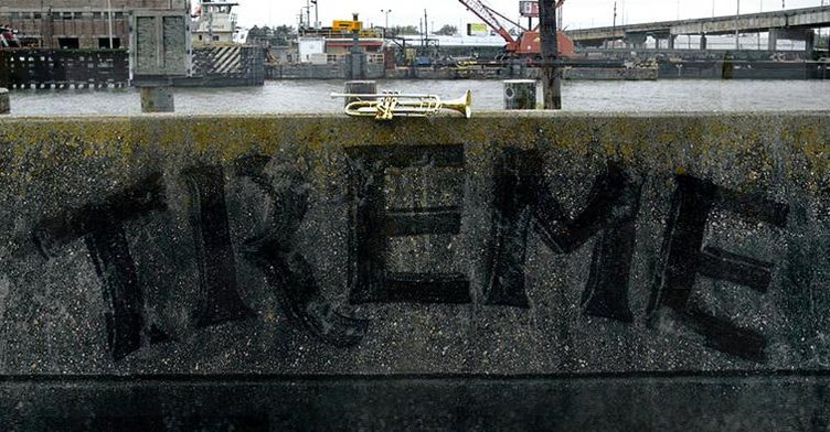
    Saints will cost you extra.

    Watching the show, loving the show, but still confused by the credits.

    (Written by Desedo friend Ryan Reynolds, who is the Design Director at MSDS.)

  • Hot Tub > Hangover

    you can dance if you want to

    I loved Hot Tube Time Machine. I hated The Hangover. Many critics are comparing the two, but the films are wildly different in their self-consciousness. The former knew it was stoopid while the latter thought itself clever. As A.O. Scott said in his review

    The undercurrent of misogyny and homophobic panic that courses through most arrested-development, guy-centric comedies these days is certainly present here. But unlike, say, The Hangover, which sweetens and sentimentalizes its man-child characters — allowing them to run wild and then run home to Mommy — Hot Tub Time Machine is honest in its coarseness and pretty tough on the fellows who are the agents and objects of its satire.

    http://www.youtube.com/watch?v=4DCFPS58KYY

  • The Heidelberg Project

    Noah

    I am in Detroit.

    I think I have a crush on Detroit.

    Last night, I realized that I always fall for cities in a state of remix and change. Witnessed this in the economic rise of Mumbai, the empty spaces of Berlin, the shifting socio- cultural politics of CapeTown/Joburg. My previous life of urban planning has stuck with.

    Intro

    Detroit has become quite the media darling, rather than me add my two cents, I suggest you read this very smart essay from New Geography, and some snark from Viceland.

    dosbirditos

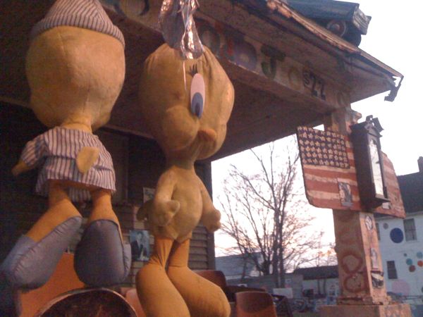
    In the meantime, here are some pics from Tyree Guyton’s mind boggling Heidelberg Project.

    candylandy

    The color and the scale reminds me of Niki de Saint Phalle’s Tarot Garden, built in empty Tuscany. Both pieces are simultaneously audacious and humble; both artists are defined by these singular works.

    dosbirditos

    Both pieces are so emotionally open that walking within them is overwhelming. You see, but moreso, you feel.

    homeric

    I know I’ll be going back to Heidelberg tomorrow.

    tickled

  • Topshop

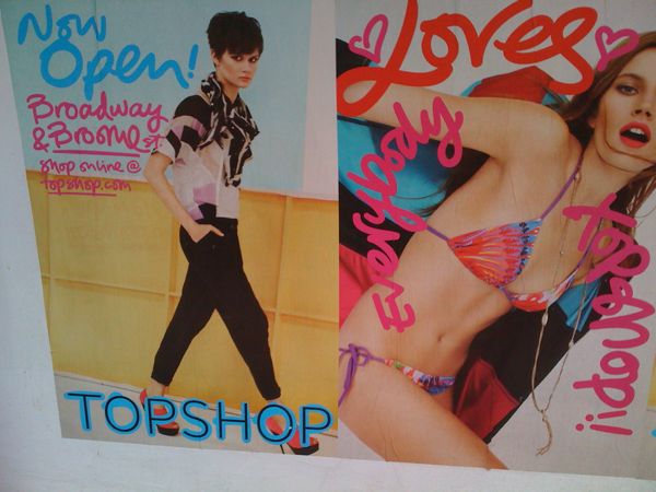
    TipTopUK fashionista fave TopShop just opened its first NYC store. Wheatpaste adverts abound. And next to some of the official ads, lurk posters that seem to poke fun at spokesmodel Kate Moss and the brand. Yet they are rather harmless and in keeping with both the brand spirit and aesthetic.
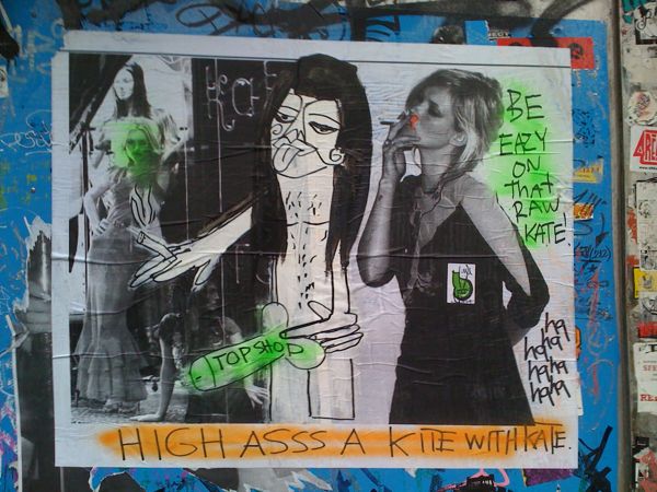
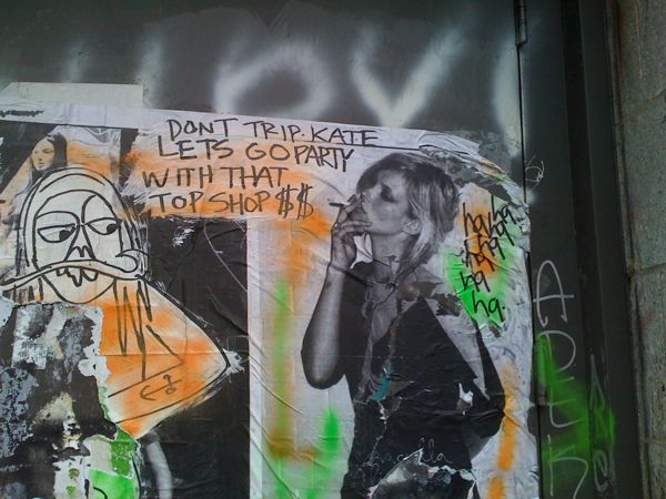
    Easy on that White
    So it makes me wonder if the snarky posters are in fact from the agency running the campaign. Are they creating their own point/counterpoint in an effort to further place the brand within the streetscape dialogue? Is it an effort to make TopShop look all the more fresh and that people care enough about it to talk it out? And if so, where does this fall within the rules of slang and advertising?
    rocking freshdress

  • Swagga Juice

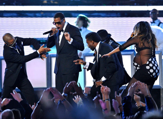
    One of the things we’ve been talking about recently at Desedo is the fluidity of identity. How different situations bring out different facets of one’s personality or brand and how this fluidity gives a picture in the round of a complex object. Witness Kanye West performing with Jay-Z in three acts:

    Hip-hop

    Hip-hop for adults

    International superstars
    full-on swag

    What we also see in these photographs is the progression both men have made as they’ve grown from being popular in hip-hop four years ago to pop icons today.

    Incidentally, Webster’s lists the etymology of the word swag as potentially derived from the Norwegian svagga to sway, rock; akin to Middle Low German swacken to rock. In other words, last night’s Grammy performance was a return to form.

    More reasons why the world needs more tuxedo owners and their swagger (like us).

  • SOE – and the hustle

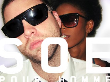
    soe ad3

    File this under the “they shoot things, don’t they?” category. This collaboration followed from the series of 20 music docs about New York City bands we did for Sony a couple years back. Lead singer DJ McNanny’s former band Neutral Mute and I collaborated on what became a kind of pet project — shooting footage from time to time vaguely in service of a music video. Though that band eventually went on hiatus, DJ’s new band AAAPE has started playing out. And his label keeps pumping out the dope remixes.

    In between, we ended up with a branded song, or an ad for a music video, or a two-minute thingy (technical term) that looks cool and allowed me to get my Terry Richardson on.

    soe ad 4

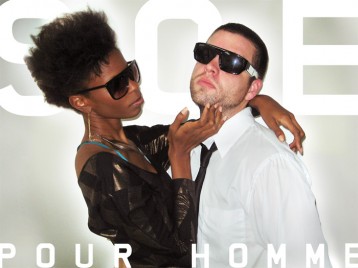
    Looking at the finished pics, there’s a temptation to holler, “our friends are cooler than yours!” But the simple truth is, that’s just how we roll. At least that’s what I tell the guys over at Citibank who keep calling. Rakesh what up, baby!

    Enjoy our State of Elation. And look out for the fragrance.


    That’s worldwide hottie Allison Caviness bringing a new level of cool to sunglasses. And, of course, she’s already shot with Terry Richardson.

  • Windell Middlebrooks

    the champagne of spokesmen.
    the champagne of spokesmen.

    Best. Name. Ever. The actor who plays the beer deliveryman for Miller High Life is Windell Middlebrooks. He grew up in Texas and has a BA+MFA in Theater. Wondering if it’s a stage name. I’m having name envy.

    He gets mad love in Milwaukee and in a small rabbit hole of WTF!? he threw out the first pitch at a Brewers game, introduced by his real name, yet in character and costume.

    jabk8BR0M64
    Riding the wave of our brokeass economy, Miller is doing a :01 Super Bowl spot in lieu of a :30 (or so they say). A grand way to position the brand as a friend to the millions who’re feeling the pinch – and without being a cloying drag. Better still, both the scripts and acting are brilliant. And best is that the ‘outakes’ stretches long, dumping you into a Dada sandbox, which is just fine with me.

    K9GwHnU2ESEHT to AS